NICE · Junior UX Designer
Customer engagement analytics
Turning multi-channel journey data into something an analyst can actually follow.

Goal
Create a clear, visual way to build, analyse and drill into customer journeys, so teams could reduce call volume, improve self-service flows and support better business decisions across web, mobile, voice and IVR.
The challenge
Design a system that helps analysts and executives explore massive multi-channel journey data and quickly understand where customers drop, succeed or fail, while working without direct access to end users, and keeping UX consistent across several enterprise platforms.
Who it was for
2 audiences, opposite needs01. Business analyst
Needs to turn complex journey data into an insight someone will act on.
Investigates customer behaviour across web, mobile and voice to understand where users drop off, repeat actions, or give up and call the contact centre. Needs a simple way to turn journey data into clear insights that reduce calls and improve self-service.

02. Executive
Needs the number, not the report.
Views high-level dashboards to understand trends, costs and customer experience at a glance. Needs fast, clear metrics that support a decision without diving into a complex report, which is a different product from the analyst's, sharing the same data.

Design
One system, four surfacesOverview
One unified customer story, stitched from channels that don't talk to each other.
Customer journey analytics connects data from web, mobile and voice into a single story. By mapping every touchpoint across structured and unstructured data, it gives teams an end-to-end view of how customers move, where they struggle, and what drives contact-centre volume: turning siloed data into friction points you can name, measure and predict.

User flow
Build a scenario, read the result, then go inside it.


Solution
Step 01. Build the journey
Decision: start from the question, not the data
Analysts create a scenario by defining the first interaction point: rather than picking their way through a data model.
“I want to see all the customers who entered the company's website or mobile app and then contacted customer service.”

Step 02. Analyse the results
Decision: show started, completed and dropped at every step
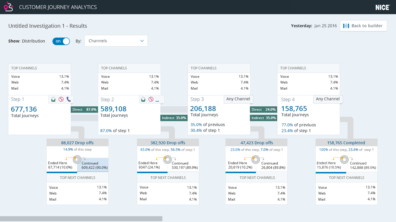
The system shows how many users started, completed or dropped off at each step, so the shape of the failure is visible before anyone reads a number.
“Why did they call, and not complete their journey at the first step?”

Step 03. Drill down
Decision: every step is a door, not a dead end
Analysts click a step to see what happened inside that journey and identify opportunities to reduce support calls, which is the whole point of the exercise.

Step 04. Channel distribution
Decision: make the channel mix legible on hover
Where journeys move between web, mobile, voice and IVR, the distribution is readable in place rather than in a separate report.
Executive dashboard
The same data, reduced to what a manager can read on a phone.
- IVR and web containment rates.
- Call-volume savings.
- Churn trends.
- Channel distribution.

IVR analytics
The menu itself is a design problem, so make it measurable.
Modern IVR systems can improve operational efficiency and the customer experience, but only if someone can see where the menu fails. Real-time analysis of interactions turns the phone tree into something you can optimise: every menu step listed with its potential saving, and data-driven suggestions for a better menu order.


Looking back
This was my first enterprise data product, designed in PowerPoint, for users I was never allowed to meet. Both constraints turned out to be formative: without access to analysts, the design had to be argued from the questions they were trying to answer, which is why every step in the flow is framed as a question rather than a feature. That habit has outlasted the tooling.